7 Steps to a Better Podiatry Clinic Website
This is a list of 7 steps to a better podiatry clinic website.
For patients who discover you online, your clinic’s website is their first contact with you and your clinic. So, it’s a valuable opportunity to create a positive impression, enhance your professional reputation, and start building trust that you are the right foot and ankle expert for them. It’s the foundation of your podiatry marketing efforts.
So if you want patients to have a better experience on your website and request appointments, you’ll love this list of tips, techniques, and strategies.
Table of Contents
1. Have a Relevant, Engaging Headline
Having a relevant headline is essential to helping patients quickly know that they’ve found the right place.

This will encourage them to stay on your site longer to learn about the foot and ankle care you provide and ultimately schedule an appointment.
A headline that is patient-focused instead of clinic-focused will connect better with patients. People visit your website looking for solutions to foot and ankle problems. So be sure to address their specific needs instead of making your clinic website read like an online resume of your education and training.
2. Improve Your Website Loading Speed
To turn website visitors into scheduled patients, your site must work quickly on mobile devices — from iPhone to tablets.

Google provides an online speed test, PageSpeed Insights, which will provide a detailed report of how your website stacks up. If your results look less than stellar, don’t worry too much. Google is a pretty tough grader and scores > 50 are good.
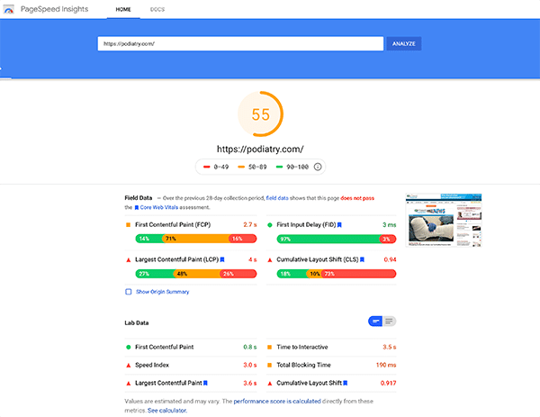
Using a responsive website theme and upgrading your website hosting are two effective ways to speed things up.
3. List How Patients Benefit From Your Care
When people come to your clinic’s site, you want to make sure they know right away about the valuable services you offer patients.
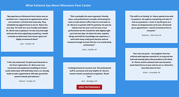
Make sure the benefits of your solutions are scannable and easy to read; featuring patient reviews and testimonials are a great way to do this.
4. Use Images & Videos of You Treating “Right-Fit Patients
Original photos, videos, or graphics can attract “right-fit” patients and effectively engage them with your practice. Avoid using generic stock images whenerver possible and photos that show your clinic empty. Ideally, each photo will include you, your staff, and the patients in your office.
Images like this will help potential patients a preview of the warmth and professional environment they will experience when seeking care with you.
Adding too many as that might cause your site to load slowly, but a few select images can communicate more to a potential patient than paragraphs of text.
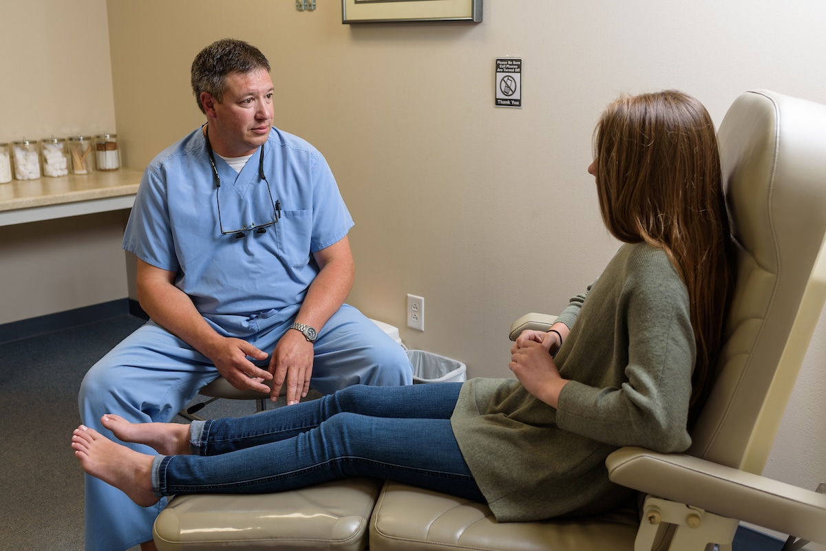
High-quality images help position you as the local foot and ankle expert in the minds of potential patients.
5. Provide a Clear Call-To-Action
A call-to-action is a button or text that communicates to your patients exactly what you want them to do on your website, and how to do it. For example, a “Request an Appointment” button that links to an online scheduling form, or a “Schedule today” message next to a clickable phone number.
See if you can pick up on the call-to-action on this clinic’s website:
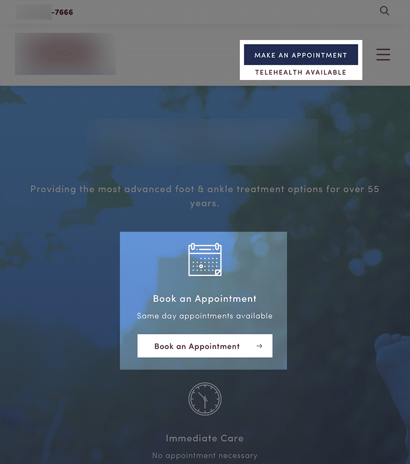
When you’re clear about the action you want people to take on your site, visitors are much more likely to take that action and schedule an appointment.
6. Make Your Contact Information Easy to Find
Making your phone number or address easy for people to find on your homepage is a great way to build trust and increase transparency with potential patients.
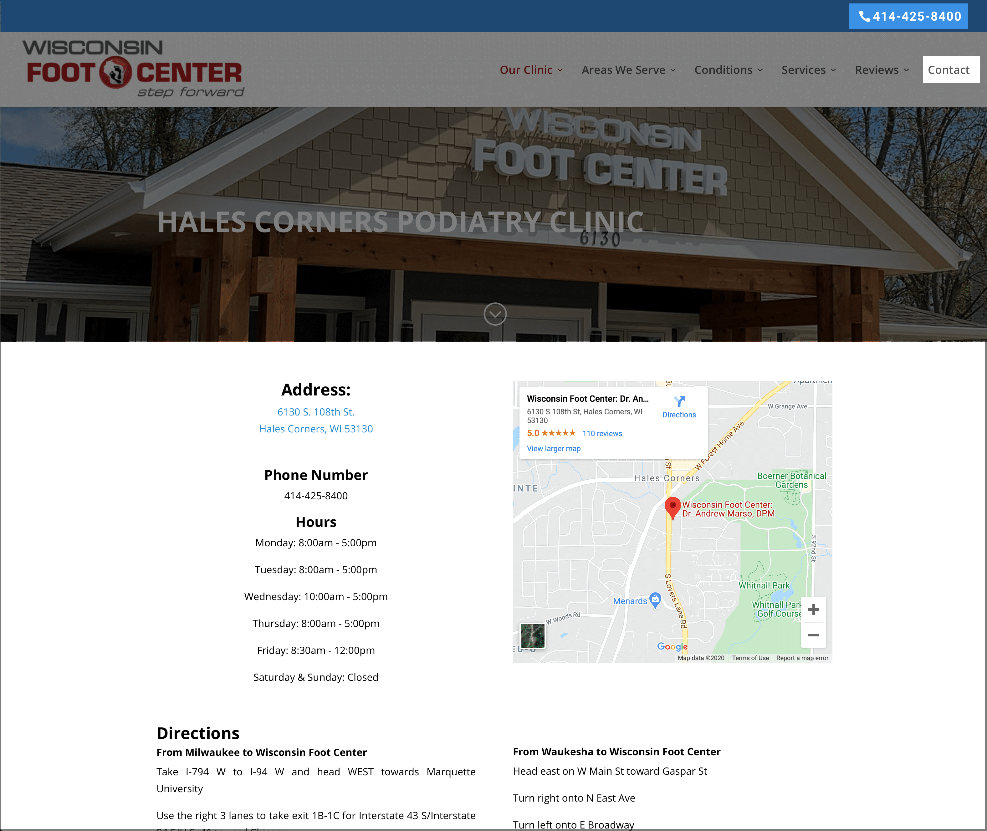
Tiny, unclickable clinic phone numbers create a frustrating experience for patients. So be sure they are prominent, and you are reachable with only a couple of taps on their smartphones.
Also, dedicate a page on your website for your clinic address, phone number, Google Map, clinic hours, and directions from popular routes to help patients find their way to your clinic.
7. Make Sure the Most Important Information Can Be Found Quickly
An easy-to-navigate website is essential if you want to turn website visitors to scheduled patients.
Here are a few more tips for creating a quality website for your clinic:
- Place important information near the top of the page – Make it easy for website visitors to find your most important content. Your patients will appreciate that it’s immediately visible so they won’t have to scroll down to see it.
- Think about screen sizes – Your patients use different digital devices, like mobile phones and tablets, throughout their day. The smaller the screen, the harder it can be for people to find what they want. A clinic website that adjusts to a patient’s device is the best way to make sure they find what they’re looking for—no matter what device they’re using
- Simplify navigation – Keep your site clean, clear, and simple by:
- Limiting the number of navigation links
- Avoiding the use of pop-ups or other features that could interfere with navigation on your site

A few simple improvements will lead to a more helpful and engaging website for your patients. After a great experience with your online presence, they will visit your clinic primed and ready to receive the excellent patient experience and care you and your staff provides.
A few changes create a more helpful and engaging experience for your website visitors.
After interacting with you online, patients will visit primed and ready to receive the excellent in-clinic experience and care you provide.
Taking time to create a unified online and in-clinic experience is appreciated by patients and helps extend the reach and professionalism of your practice.
Improve Your Clinic Website to Grow Faster
I hope you found this post helpful.
Now here’s a chance to take what you’ve learned and apply it to your podiatry practice. I’ve created a free clinic website guide, so you can see what you’re doing well and where there’s room for improvement.
Subscribe to the Newsletter
Share this Article on:
Build A Practice
You Love

